Test a Website on Different Screen Sizes
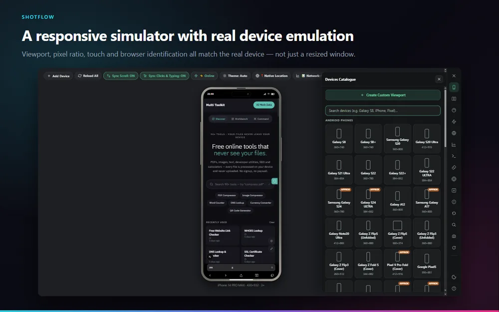
Dragging a browser window narrower is not a mobile test. The page still reports a desktop pixel ratio, still receives mouse events instead of touch, and still identifies itself as a desktop browser — so anything that branches on those behaves differently from a real phone.
How to do it
Open ShotFlow on the page you want to test
Switch to Simulate and open the workspace. The current page loads inside the device.
Choose a device
Search the catalogue by name — Galaxy, Pixel, iPhone, iPad, MacBook — or create a custom viewport.
Rotate and compare
Flip between portrait and landscape, or add a second and third device side by side.
Scroll and click once, everywhere
Sync Scroll and Sync Clicks mirror your interaction across every open device, so you compare the same state rather than re-navigating each one.
Capture what you found
Screenshot the framed device straight from the rail, or open Mockup Studio to export it on a backdrop.
What makes it different
Real emulation, not a resize
Viewport-meta behaviour, device pixel ratio, touch input and browser identification all match the chosen device, through Chrome’s DevTools Protocol.
Multi-device sync
Open several devices at once and have scrolling, clicks and typing mirrored across all of them.
Network and locale
Throttle the connection, override geolocation, timezone and locale, and switch the page between light and dark.
Responsive tester, free and without an account
Nothing you capture leaves your browser unless you choose to share it.
Add to ChromeQuestions
How do I test my website on different screen sizes?
Open ShotFlow’s Simulator on the page, pick a device from the catalogue, and the page renders inside a frame at that device’s real viewport. You can open several at once and keep them in sync.
Is this different from just resizing my browser?
Yes, substantially. Resizing changes width only. ShotFlow applies the device’s pixel ratio, touch input and browser identification too, so responsive images, touch handlers and any user-agent branching behave as they would on the device.
Is it the same as testing on a real phone?
No, and nothing that runs in a desktop browser is. It is one rendering engine emulating a device, which catches layout, breakpoint and touch problems — but final testing on real hardware still matters.
Which devices are included?
76 profiles across Android and iOS phones, foldables, tablets, laptops, desktops and TVs, plus custom viewports you define yourself.
Why does ShotFlow need the debugger permission?
Chrome’s DevTools Protocol is the only API that can apply real device emulation, and Chrome does not allow that permission to be optional. It attaches only to ShotFlow’s own preview tab while the simulator is open, and never reads the pages you browse.
Also in ShotFlow
Device mockups
Drop a capture into a phone, tablet or laptop frame on a chosen backdrop, in flat or isometric perspective.
Read more →Full page screenshot
Capture an entire webpage in Chrome, including everything below the fold, in one image.
Read more →Screen recorder
Record your desktop, a single Chrome tab, a region of a tab, or your camera.
Read more →